It has been two weeks since we looked at the trajectory of COVID-19. Here are a few new indicators. Figure 1 shows the number of cases per million residents, by state. Our neighbors in Minnesota are enjoying their “geographic distancing” from Chicago. But there is something else at work. Perhaps it is Scandinavian abstinence.
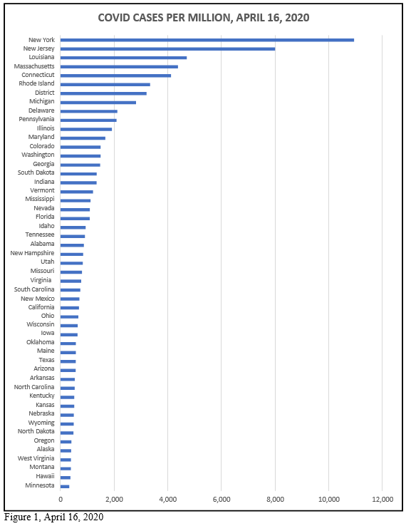
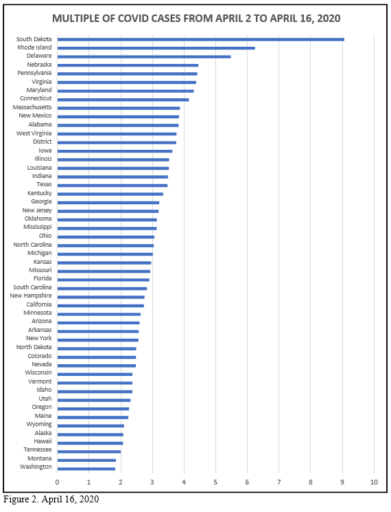
Figure 2 shows the change in the number of cases since April 2. Rhode Island and Delaware are understandable—proximity to New York and New Jersey. But remote and de-populated South Dakota? We now know that the governor of that lovely land figured she knew better than the medical experts and fake media. As we say where I grew up out west, “If you f…with the bull you get the horn.” Someone from South Dakota ought to understand a little cowboy wisdom. But partisanship still reigns.
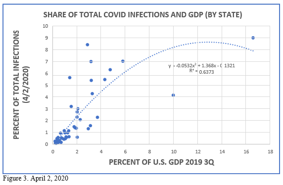
Now I revisit a graph I sent on April 2, 2016 relating the share of total cases with the share of GDP (3rd quarter of 2019). Recall that this excludes New York and New Jersey—obvious outliers. The two extremes are California (top right) and Texas (below the curve in the middle).
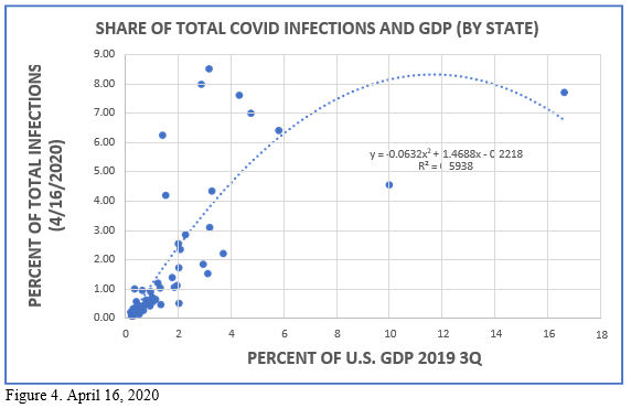
And here are the same data for April 16, 2020. Notice that my little model now accounts for a slightly smaller share of the variation in cases in relation to share of GDP (R2=0.5938 versus 0.6373). This is expected as the virus spreads out away from the origins (economic and travel nodes). As the situation evolves other factors are assuming greater salience—elderly populations, general health conditions, absence of strict social distancing (South Dakota).
Dr. Daniel Bromley can be contact at dbromley@wisc.edu.