A number of questions concern the nature of the post-COVID recovery. Obviously there is no prior experience to draw upon. But a few indicators may help us make reasonable inferences in this regard.
I must start with a quite recent experience that—while very different in certain important aspects—is still somewhat helpful. In late 2007 the U.S. started into what is now called the Great Recession. This was not caused by layoffs, closings, and stay-at-home orders. In other words, it had nothing to do, in the beginning, with job losses, closings, etc.
That event was a financial crisis in which banks and other sources of cash (liquidity) suddenly froze up and—if not quickly rectified—threatened to visit serious long-term harm. The banks and large companies were saved by quick action from the government. Even today, there is residual criticism that the large corporations and banks were rescued, but workers were not.
This was a crisis of excessive leverage—debt to assets (or debt to income) was quite high and in such circumstances, the economy is on a “knife’s edge” – the slightest event can trigger fear.
Holders of debt start calling in loans. Figure 1 shows the ratio of debt to income for U.S. households (not businesses) since the first quarter of 1980. This was an era of low interest rates and households were taking on increasing levels of debt. Notice that this ratio had doubled since 1980.
I recall learning, during the latter part of this period, that a favorite activity of school teachers was spending their summers buying, “fixing up” and then selling houses. The term-of-art is “flipping.” Given the salary level of school teachers, I found this to be a surprising past-time. This was an ominous sign that many people missed.
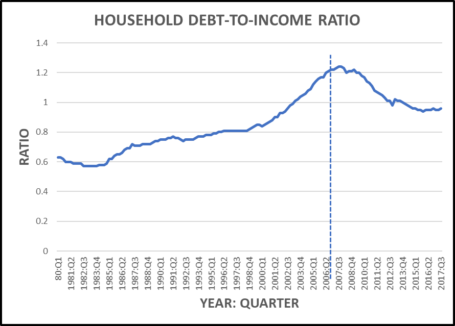
Figure 1. Vertical line at start of Great Recession.
A related event was the expected growth in debt-service obligations as a percent of disposable income (Figure 2). This is NOT debt per se, it is the service costs of holding debt (interest and fees). Since 1980, that had grown from just over 10 percent of disposable income to 13 percent. This is not a large jump, to be sure. But, looked at in another way, debt services costs had grown by about 1/3. Things that look small through one lens, can look large through another.
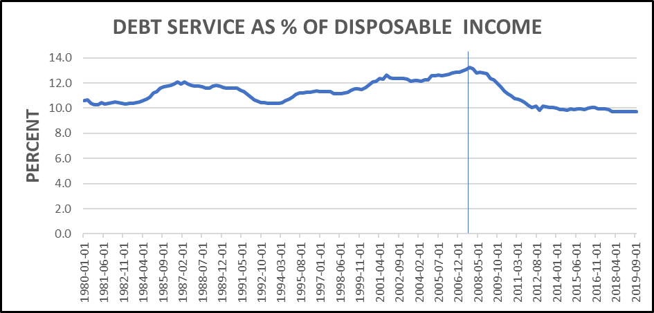
Figure 2. Vertical line at start of Great Recession.
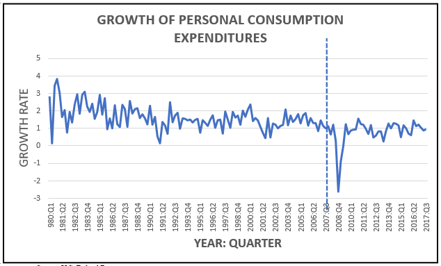
We now come to another interesting series. Household spending accounts for about 2/3 of total GDP (expenditures), so when household spending starts to fall, total economic activity will begin to feel the effects. Figure 3 shows the GROWTH RATE (from year to year) of consumer spending, and since 1980 that rate has been falling. In the early 1980s such spending was growing at about 2% each year. By 1990 it had dropped into the range of 1-1.5 percent growth (year to year). By 2003, we see a rather pronounced decline leading into the Recession that began in late 2007. Now, the increasing burden of debt service might seem to be eating into consumer spending. And recall from Figure 1 that this was a period of pronounced increases in the debt-to-income ratio. Households were taking on greater debt.
These trends in debt and consumer spending are instructive as we now turn our attention to the income side of the equation—an issue that now drives the current crisis. This is not a financial crisis driven by excessive leverage and debt service. It is an income crisis driven by job losses and associated disappearance of consumer spending.
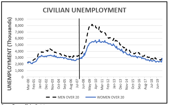
Figure 4 shows civilian unemployment by males and females over the age of 20. Recall that “unemployment” is a reflection of those who are actively seeking work and unable to find it. Discouraged workers (those who have given up) are not counted.
We see that prior to 2007, there had been a reasonable period of falling unemployment— especially among men. But the Great Recession hit men more than it hit women and there is some speculation that this frustration at unwanted idleness among men (often over 50-55) fueled “white anger” leading into the 2016 elections.
The ominous aspect of Figure 4 is not so much in the jump during the Recession (2007-2009). The frightening part is that it took 4-5 years for the level of unemployment to drop back to where it had been prior to the Recession in 2007-2009. At the time of the 2016 election, unemployment was above where it had been in 2003-2004.
We now come to Figure 5 showing the most recent monthly number of unemployed (in thousands). These are seasonal data so it is in comparison to the corresponding month (year over year). A negative number indicates that there was less unemployment for that month than in the prior year (for that month).
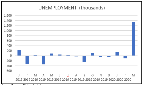
Figure 5.
We must keep in mind that the jump for March 2020 reflects preliminary estimates, and is a serious underestimate since many unemployment claims have not yet been recorded.
The pressing question now is what can we expect in terms of a “rebound” once the pandemic and its associated threats are behind us. Household debt-to-income levels remain high, debt service as a percent of disposable income remains high, and the growth of personal consumption expenditures has remained modest. You may recall the president grousing about low GDP growth—wishing to see it in the range of 2-3 (even 4-5 ) percent. He keeps criticizing the Federal Reserve for not doing enough to increase growth. The level of GDP and its trends have always been reasonable indicators of consumer (voter) satisfaction.
But GDP (and its growth) cannot simply be “willed” up (or down). It is a function of the stock of capital (machines) and workers (employees). And, of the change in output per unit of input of those who work at (or with) those machines—labor productivity.
Recall that 80 percent of the American workforce is in the services sector. In Figure 6 I show the sector breakdown of employment for the recent past. We now know that several large aspects of the service sector (retail, leisure/hospitality, trade/transport) are under great duress.
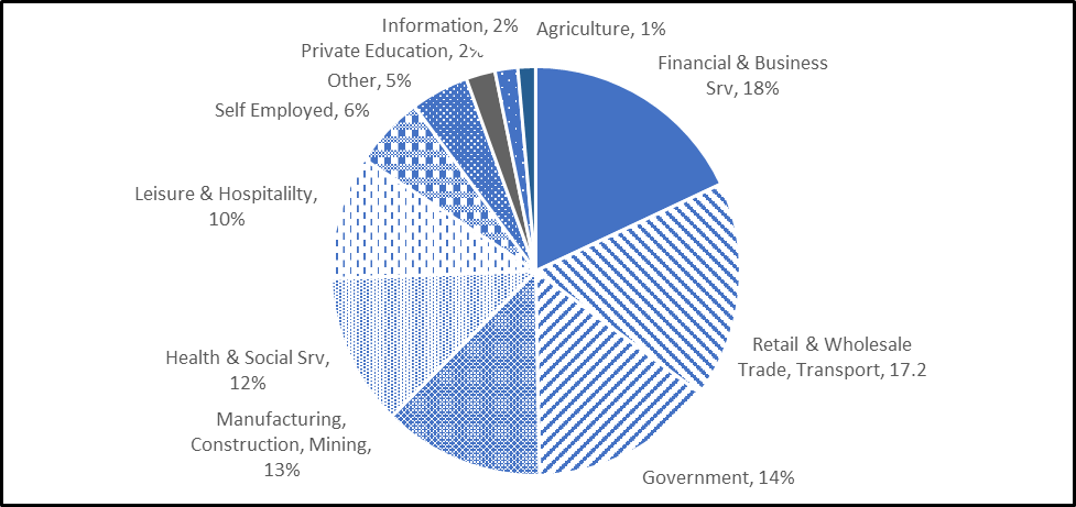
Figure 6. Employment by Sector
When those sectors do begin to recover, there is great uncertainty about the level of employment that might then be on offer. Every business will, I predict, be interested in reducing its reliance on human labor. Many business owners are distressed at the human trauma associated with this crisis, and they certainly feel a serious moral obligation to their workers. Ironically, that personal distress may have the unintended effect, over the long run, of pushing firms in the direction of fewer workers. This will be pronounced in those sectors most vulnerable to economic downturns (restaurants, travel and leisure).
As Amazon and other on-line retailers gain market share against the shrinking “bricks- and-mortar” stores, automation will certainly increase. I predict that the loss of jobs in the service sector will follow and mirror the earlier loss of manufacturing jobs I showed in an earlier post.
To sum up, look again at Figure 4 above, and imagine that long right-hand tail of unemployment climbing once again to a civilian unemployment level of 4,000-5,000 (that is 4-5 million) for the next 5 years.
I could be wrong—though it is unlikely 😊
Dr. Daniel Bromley can be contact at dbromley@wisc.edu.